Pick the color for your room!
If you are going to paint the walls in your room, you can see how the color looks in the interior using the free online tool roomcolor.net
Our website contains the most popular palettes (color catalogs), which are used for machine tinting in stores.
- 1Choose a palette
- 2 Choose a room to paint
- 3Choose a color (rectangles)
- 4Click on a surface
- Use color families (circles) for more convenient moving to desirable color
- If you already know the color number, you can find it through the search bar.
- You can download your result as PDF or JPEG or share it via messengers.
Important information
- All colors of the presented palettes match with the colors on the official websites of manufacturers. But keep in mind that color perception on a screen may differ from reality. Therefore it is recommended to check the selected colors with fandeck in a store and make trial colors if necessary.
- Many factors affect the perception of the color of a topcoat. Among the main types, one can distinguish such as the degree of gloss of the paint (the more transparent the coating, the more saturated the color looks), the degree of surface illumination, the light source (sunlight or artificial lighting), the texture of the surface. Moreover, you may notice that you look slightly different. This is because different rooms have different lighting levels and different light sources.
- {{ item.value }}
- {{ item.value }}
Blue in interior design
Blue is a pleasant and delicate color. It is associated primarily with air and sea endless spaces, clear skies, frosty freshness. This is the color of contemplation and reflection. It pacifies and adjusts to a harmonious mood, and also has a beneficial effect on the thought process. Blue is much more readily chosen as the main color of the room than, for example, red or yellow, but still there are many prejudices about the fact that it will be cold or uncomfortable in such an interior. In fact, there is no color better to create a feeling of freedom in an apartment, which is often not enough for comfort.
Where to use
Blue is a fairly versatile color in terms of styles. It refreshes the classic interior well, it is appropriate in neo-baroque and minimalism, as well as in modern.
Blue looks appropriate in high-tech style, since it is strongly associated with technology, first of all, with the bluish glow of gadgets. Truly in its place, blue will be in Provence, which is characterized by a tendency towards whitish shades and an abundance of light.
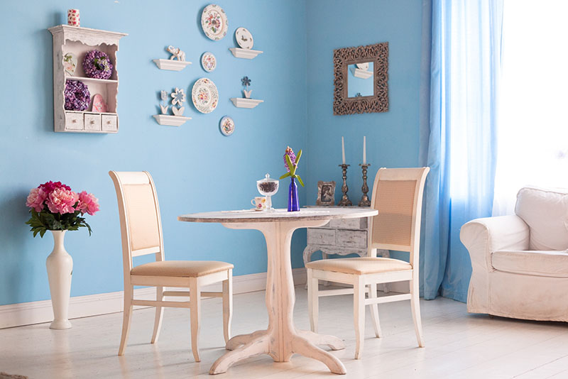
Light blue shades make the room almost transparent. The soft blue color combined with wood, lace patterns and glass is a constant companion of the shabby chic style, based on very light cream shades of blue, beige and pink.
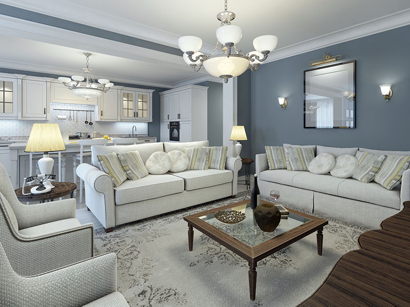
Gray-blue or gray-lilac colors are an excellent alternative to beige, which many prefer in the hope of not taking risks. These shades can be combined with almost anything, while looking stylish and cozy.
A bolder alternative to blue is blue, one of the three primary colors on the color wheel. It is mainly used when it is necessary to create a rich and at the same time cozy atmosphere. The "royal" shades are primarily dark blue. It is best suited for relaxation areas - bedrooms, living rooms and sometimes dining rooms - as it has a relaxing effect.
The true luxury of navy blue is paired with gold. This combination allows you to create a modern and "royal" interior at the same time.
In the Moroccan style, dark blue will also find a use. In combination with other bright colors, ornaments and numerous details, it reveals its “exotic” potential.
Less versatile are the colors included in the rich blue group. These include azure, cobalt colors, ultramarine and others. Due to the greater brightness, these shades will not always contribute to relaxation, so it is appropriate to use them as accents. Or in the role of the main color - but provided that less active colors are used. But rich blues are good in a space whose purpose is to inspire and fill with energy.
In the interior of a house, apartment
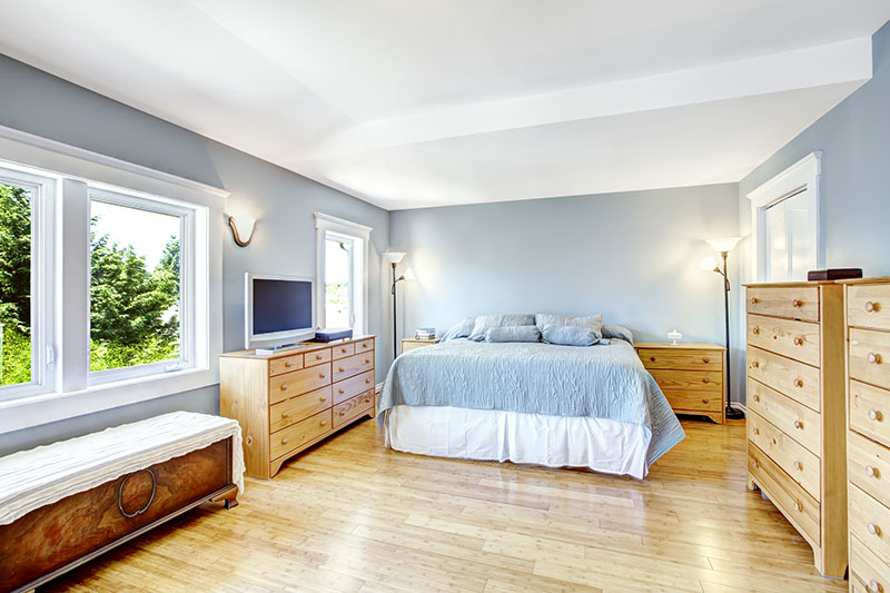
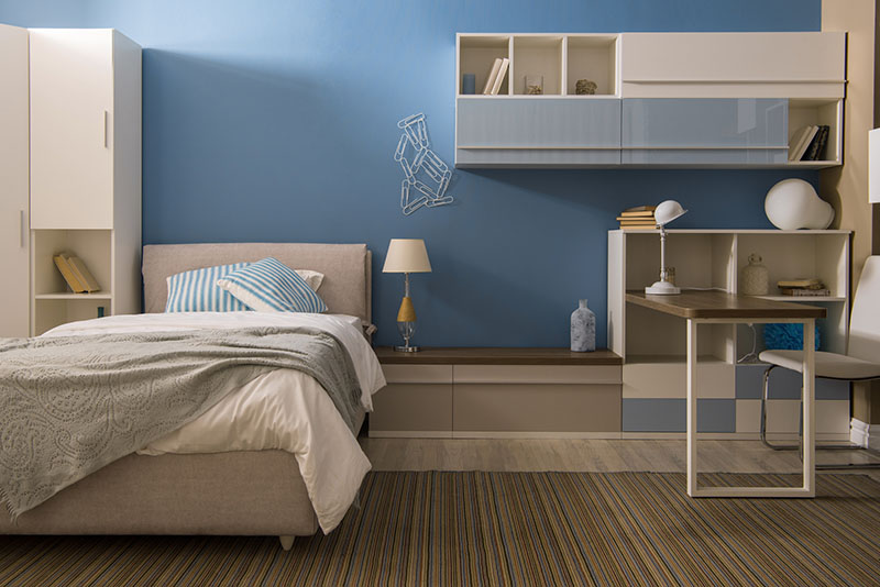
The color blue is widely used in the design of bedrooms, because it has a relaxing effect and allows you to rest. However, depending on the size of the room, the same shade can give completely opposite results. In a large room, any shade will be appropriate, while in a small room, due to a lack of light, it will also be perceived gloomily. Artificial lighting will help to correct perception: so that the space does not look completely dull, it is worth abandoning cold and even neutral light in favor of warm one. In addition, you can always tone down the color by matching it with furniture, flooring or decor in warm colors.
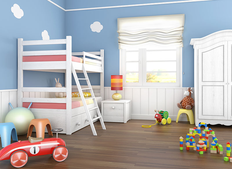
The blue nursery is ideal for babies or very active children. However, psychologists warn against "overdose": in large quantities, blue and blue colors can depress the nervous system. Do not forget that the worse the room is illuminated, the more warming colors should be in it: beige, yellow, orange, brown. White furniture is a good counterweight.
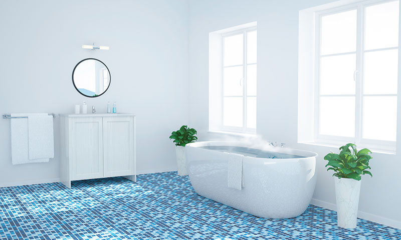
In the bathroom, blue is appropriate as no other color, since it is first of all associated with water. An interesting effect can be achieved if the floor is laid out with a blue-blue mosaic: this will create the effect of "flowing" and complete immersion in the water element.
Blue promotes creativity. In this regard, it is recommended to use it in offices, classrooms or classrooms. Combined with yellow, you can get an environment that improves concentration and organization.
For decorating a kitchen in blue or blue, in addition to the aesthetic one, there is also a physiological reason. Shades of blue reduce appetite, which can be a decisive factor for many people. But in pursuit of the desire to lose weight, it is important not to forget about comfort: it can be created by a countertop, floor or apron, made in a warm range.
Combinations
To combine soft blue, like blue, is always appropriate with white. This pair will surely have a balance; and such an interior is inevitably associated with a marine theme, which many will like. A more contrasting and interesting combination can be obtained by combining blues and blues with warm shades.
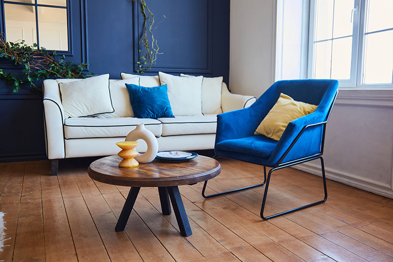
A cozy interior dominated by pure blue and other saturated shades will look good with natural woody or contrasting colors: yellow, green, orange. The combination with green has been tested by nature itself: it is found in the depths of the sea, in the plumage of some birds, reminiscent of wildflowers, so the potential of this pair should not be underestimated.
It is not recommended to combine blue with a red palette: the room in such a frame will be lost, it will look gloomy. Yellow and orange will help to additionally illuminate and warm the room.
A popular combination of light blue with deep blue. In this duet, the depth of the sea begins to be felt well, and the situation becomes more significant.
In well-lit rooms with large windows and high ceilings, you can combine blue with purple. The result will be a rather cold picture, which can be diluted with geometric or floral prints, textured elements.
Absolutely any decor is suitable for the decorated blue interior: bronze and silver, brass and gold.
Other colors in interior:
Gray and neutral shades in interior