Pick the color for your room!
If you are going to paint the walls in your room, you can see how the color looks in the interior using the free online tool roomcolor.net
Our website contains the most popular palettes (color catalogs), which are used for machine tinting in stores.
- 1Choose a palette
- 2 Choose a room to paint
- 3Choose a color (rectangles)
- 4Click on a surface
- Use color families (circles) for more convenient moving to desirable color
- If you already know the color number, you can find it through the search bar.
- You can download your result as PDF or JPEG or share it via messengers.
Important information
- All colors of the presented palettes match with the colors on the official websites of manufacturers. But keep in mind that color perception on a screen may differ from reality. Therefore it is recommended to check the selected colors with fandeck in a store and make trial colors if necessary.
- Many factors affect the perception of the color of a topcoat. Among the main types, one can distinguish such as the degree of gloss of the paint (the more transparent the coating, the more saturated the color looks), the degree of surface illumination, the light source (sunlight or artificial lighting), the texture of the surface. Moreover, you may notice that you look slightly different. This is because different rooms have different lighting levels and different light sources.
- {{ item.value }}
- {{ item.value }}
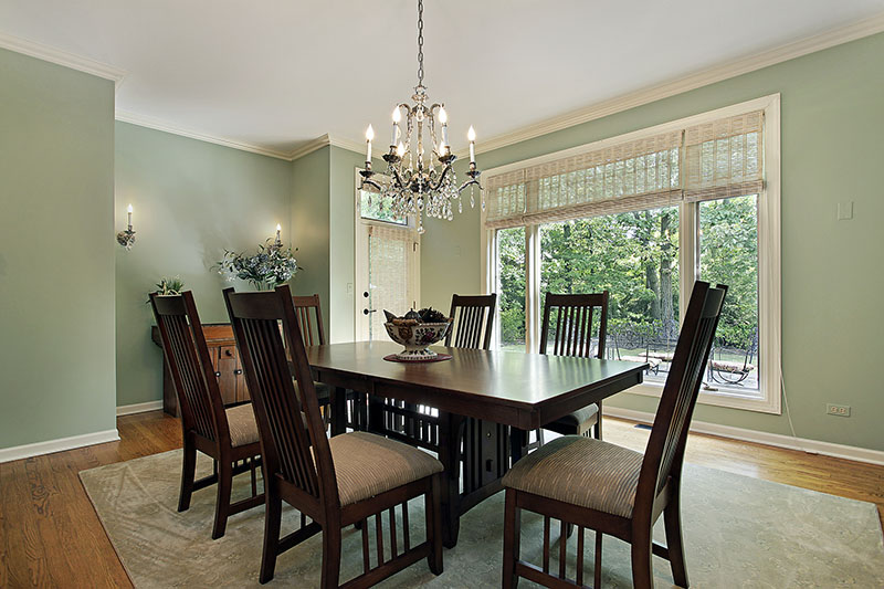
Green in interior design
Green and all its shades are familiar to the human eye, as they are very common in nature. This is a scientifically based fact that explains why people love natural colors when decorating their homes. Therefore, designers have created a huge number of options for combining green with other colors.
It should be borne in mind that green itself has a neutral temperature. Green-yellows are warmer, while blue-greens are colder.
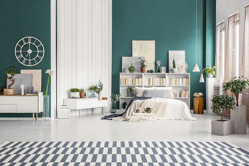
Psychologists are of the opinion that the correct combination of green with other colors helps to keep calm and give a sense of security and confidence.
One of the most important points is the effect of color on health. The green design in the room will help you achieve psychological balance and relaxation. In other words, it is the color of relaxation and rejuvenation.
Olive green
Olive green is a very attractive shade of green that is versatile enough to offer a wide variety of shades and tones. These many shades help you try out a variety of styles and themes in your apartment. By nature, darker shades of olive green have an "expensive" appearance, while lighter shades are perceived as lighter.
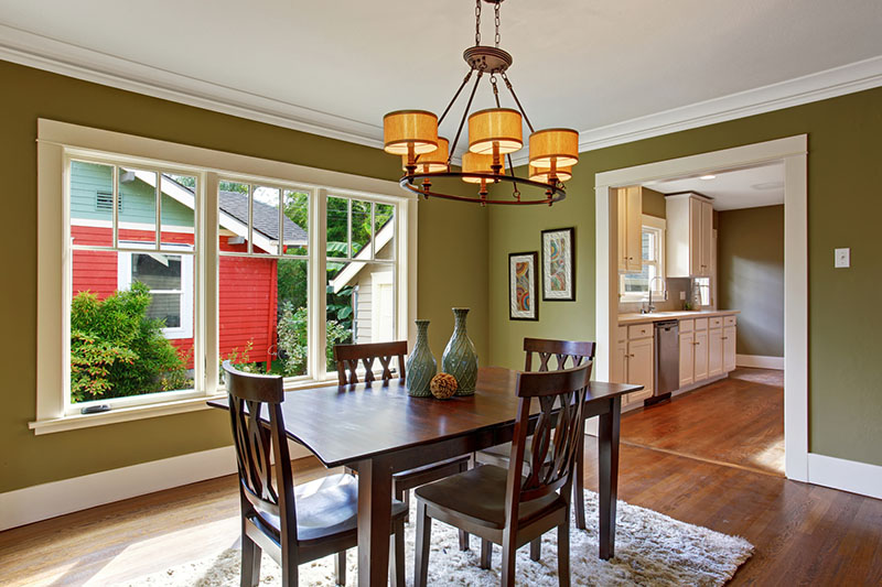
When choosing a shade, keep in mind that darker shades should be used in spacious rooms that have a lot of sunlight. And, accordingly, lighter ones - in compact rooms, in which they are not very illuminated by daylight.
The deep and dark olive color is one of the best when it comes to modern urban interiors. It is a color that can easily replace graphite gray or black in a bachelor loft, creating a sophisticated backdrop. It's much more understated, and in its matte finish, it looks just as cultured. This color is suitable for different styles and can be adapted if desired.
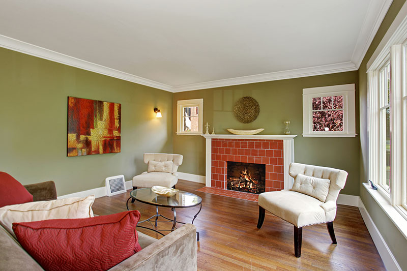
The beauty of olive shades is that they are organically combined with even the brightest colors. In fact, olive gray is a great neutral color, which gives rooms like the bedroom and dining room a cozy backdrop, even when other bright accents are present. Hot pink, hot orange, sunny yellow or bright red - this shade can be combined with almost any color, depending on the style of the room and the available space.
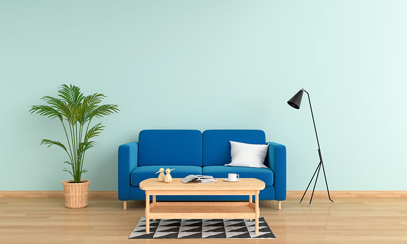
Mint green
Mint green is a great shade to refresh a room. It's light, fun, and very fresh. You can use mint instead of other neutral colors. It adds brightness, but remains calm and subtle enough to have the same effect as neutral. In fact, you can say that mint green is neutral.
Combinations of mint green
Because mint green is so close to neutral, it can be paired with just about any other color. Your best bet is to think about the mood you want to create and then trust your own eye. Its appearance will always depend on the amount of natural light in your room, so check the shades in your room before making your final decisions.
Mint and white – a clear and fresh combination. Try combining mint green walls with white furniture, or vice versa. In addition, the white décor and stucco molding on the mint walls really grab attention and add design flair.
Mint and brown. To add a touch of luxury to the mint green, try brown. Natural wood furniture or stucco decorations are suitable for this.
Mint and coral. Pairing mint green with coral is a great way to create a fresh and invigorating palette. Textiles and pillows look great against a mint background.
Mint and gray : adding gray to mint is a great way to calm its natural energy. To keep the palette soft, use a light gray rather than a dark one.
Mint and aquamarine. The combination of these colors will give a true retro feel. You can dilute this pair with some bright color, such as red or yellow.
Mint and lavender. This combination is suitable for creating a feminine and beautiful atmosphere. Lavender is a good substitute for pink if you have a desire for a soft, but not too girlish interior.
Mint energy will always be popular, so don't worry about your mint green furniture going out of style. However, if you're unsure about the mint green decor, try adding color in small doses. Accent pillows, window trims, even small vases and objects will add a pleasant freshness to any room. You can pull them out in the spring when you want to add freshness, and remove them in the fall when you're ready to change.
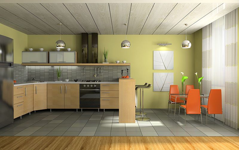
Pistachio green.
Pistachio, a mixture of green and yellow, has an undeniable appeal and is suitable for decorating any room. This color can be combined with any shades, both classic and more extravagant.
There are several of the most advantageous combinations. For example, pistachio goes well with wood products - be it light or dark. Combinations with straw or bamboo products will look great.
The classic combination with beige and cream will also be successful. An equally popular combination is with pale pink. An interesting palette can be created using turquoise and blue decor elements.
Pistachio as such may seem too catchy to someone for decorating bedrooms and children's rooms. In this case, gentle pistachio shades are suitable. They can also be easily combined with pastel colors - beige, pale blue, turquoise.
But for the kitchen, pistachio green is perfect. His liveliness will cheer you up and whet your appetite. The color can be used both as a background and on the facades of the headset.
Other colors in interior:
Gray and neutral shades in interior