Pick the color for your room!
If you are going to paint the walls in your room, you can see how the color looks in the interior using the free online tool roomcolor.net
Our website contains the most popular palettes (color catalogs), which are used for machine tinting in stores.
- 1Choose a palette
- 2 Choose a room to paint
- 3Choose a color (rectangles)
- 4Click on a surface
- Use color families (circles) for more convenient moving to desirable color
- If you already know the color number, you can find it through the search bar.
- You can download your result as PDF or JPEG or share it via messengers.
Important information
- All colors of the presented palettes match with the colors on the official websites of manufacturers. But keep in mind that color perception on a screen may differ from reality. Therefore it is recommended to check the selected colors with fandeck in a store and make trial colors if necessary.
- Many factors affect the perception of the color of a topcoat. Among the main types, one can distinguish such as the degree of gloss of the paint (the more transparent the coating, the more saturated the color looks), the degree of surface illumination, the light source (sunlight or artificial lighting), the texture of the surface. Moreover, you may notice that you look slightly different. This is because different rooms have different lighting levels and different light sources.
- {{ item.value }}
- {{ item.value }}
Brown in interior design
Brown is a composite color made by mixing red, yellow and blue. It is a natural color, as it is widely found in nature - wood, soil, etc.
The living room, decorated with brown, is considered one of the classics in interior design. Without a doubt, this color, with its many beautiful shades, including beige, is one of the most popular and classic in the design environment.
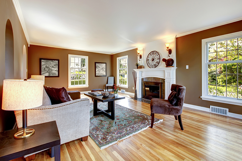
There is one important detail: all shades of brown go well with each other, and such combinations can favorably emphasize almost any style.
There are all sorts of shades of brown, such as cappuccino, chocolate (milky and dark), tree bark or stained wood. They will give the room warmth, coziness and make it closer to nature.
Using these shades, you can decorate the living room in any style. Designers choose brown in many styles such as classic, minimalism, loft. Incredible comfort and stability are the feelings that arise when you find yourself in an interior decorated in a brown palette.
When using this color, do not forget about the important rule - do not make your room monochrome, you need to complement brown with other colors. Overloading dark shades of brown can make it look a little surly and visually diminish it.
Combinations.
It is difficult to find a color that would not go well with brown, because almost the entire color palette is perfectly combined with it. But there are also the most successful classic combinations.
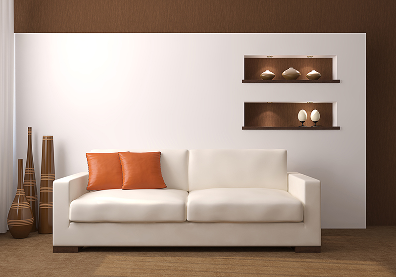
White. White will give brown elegance and dilute it well. This combination can resemble a chocolate cake with a white interlayer.
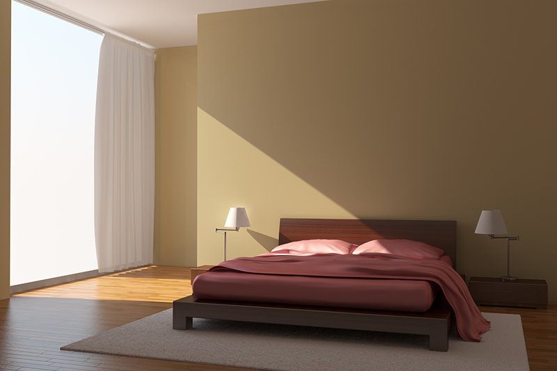
Pink / lilac. It would seem, where is brown and where is pink? But pink or lilac furniture goes well with brown walls and makes the interior refined and rich.
Blue and blue-green. Brown is a warm color, so it pairs well with shades of blue such as turquoise, malachite, and emerald.
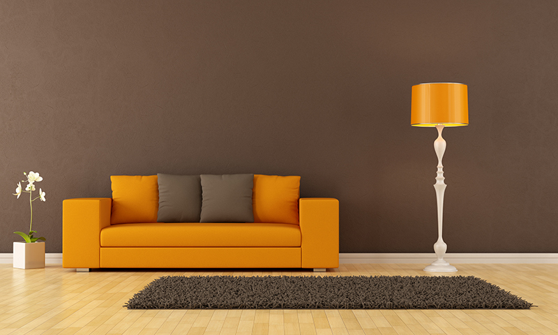
Yellow/orange. The interior of the living room in brown tones can be successfully diluted with elements of shades of yellow - orange, gold or mustard.
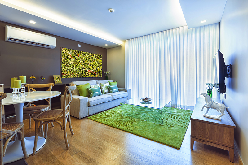
Green. Shades of green such as herbal, olive, marsh will perfectly complement the brown interior.
Natural colors of nature. Brown is the color of wood and earth, and naturally combines with green leaves, blue skies, sandy riverbanks and orange sunshine. If you use these colors, then the interior will be as harmonious as possible.
Other colors in interior:
Gray and neutral shades in interior