Pick the color for your room!
If you are going to paint the walls in your room, you can see how the color looks in the interior using the free online tool roomcolor.net
Our website contains the most popular palettes (color catalogs), which are used for machine tinting in stores.
- 1Choose a palette
- 2 Choose a room to paint
- 3Choose a color (rectangles)
- 4Click on a surface
- Use color families (circles) for more convenient moving to desirable color
- If you already know the color number, you can find it through the search bar.
- You can download your result as PDF or JPEG or share it via messengers.
Important information
- All colors of the presented palettes match with the colors on the official websites of manufacturers. But keep in mind that color perception on a screen may differ from reality. Therefore it is recommended to check the selected colors with fandeck in a store and make trial colors if necessary.
- Many factors affect the perception of the color of a topcoat. Among the main types, one can distinguish such as the degree of gloss of the paint (the more transparent the coating, the more saturated the color looks), the degree of surface illumination, the light source (sunlight or artificial lighting), the texture of the surface. Moreover, you may notice that you look slightly different. This is because different rooms have different lighting levels and different light sources.
- {{ item.value }}
- {{ item.value }}
Gray and neutral shades in interior design
Gray is not just a "new beige", it is a completely different approach to working with color, shadows and textures in space. This is not just a combination of white and black, you can often notice completely different shades in it: pink, blue, green and many others - and the color itself can be both warm and cold. Depending on these conditions, gray can look austere or homely, businesslike, boring and unfriendly, or deep, picturesque, intriguing.
Similar color options (not exact match):
| Tikkurila G490 | Tikkurila H490 | Dulux 90BG 63/043 | Dulux 10BB 55/065 |
At the physiological and psychological level, gray has a rather beneficial effect: it slows down negative processes in the nervous system, calms and allows one to abstract from emotions, which makes it indispensable in the design of a workplace, for example. There is also a connection between gray and sad emotions, but this does not automatically mean that gray is completely contraindicated for people prone to sad thoughts; its different forms can successfully fit into the interior without overshadowing it at all.
Gray, together with numerous tones, is included in a neutral palette and makes up a cold scale; shades of brown are responsible for warm. All of them have long and confidently displaced beige from the place of the simplest and safest shade for the interior and are perfectly combined with each other. Some shades, such as taupe (taupe, to simplify) and graphite, have become firmly established in the pantheon of gray tones.
The shades of fieldgrau (gray-green), marengo (gray with a blue tint), gray-blue, which are more active in comparison with them, do not lose the main advantages of gray: they are easily combined in the interior with other neutral colors, they collect space and demonstrate the possibilities of textures.
Similar color options (not exact match):
| Tikkurila J496 | Tikkurila K496 | RAL 7047 | Dulux 00NN 53/000 |
There are three main advantages of neutral colors:
1. Materials located against a background of muted shades acquire special clarity and texture.
This opens up a wide variety of textures to make the interior look more layered and deeper. In this case, it is not necessary to add a contrasting color: on the contrary, a bright colored wall will “eat up” the textures of the elements located on its background, while on a gray or neutral background both the pattern of natural wood, the gloss of the tile, and the embossed stone, and fabrics will show yourself at your best.
2. Neutral interior does not get boring. Any experiments with decor and accents can be carried out in it. Changing a couple of parts will give a completely new effect, so it will always be pleasant to be in such an environment - she is ready to adapt to any desires at any time. This is especially true for people who do not like to limit themselves in self-expression and, in principle, love freedom.
3. In a neutral setting, the individual features of the interior are best manifested, making it unique and unrepeatable. On an unremarkable, at first glance, background, objects that reflect the personal preferences of each person look best. In any other interior, there are unspoken frames of color and style; in a gray, discreet environment, you can not adjust to the room, but combine any prints, decorative and architectural elements, paintings and patterns.
Where to use
Austere classics are good for neutral tones. In this case, gray can be combined with warm shades of furniture and flooring. "Inexpressiveness" is easily eliminated by the variety of classic and neoclassical elements in furniture and architectural details.
For modern style, minimalism and asceticism, a neutral palette opens up a wide scope. Monochrome combinations are suitable for these directions, in which the leading position is given to black, white and gray.
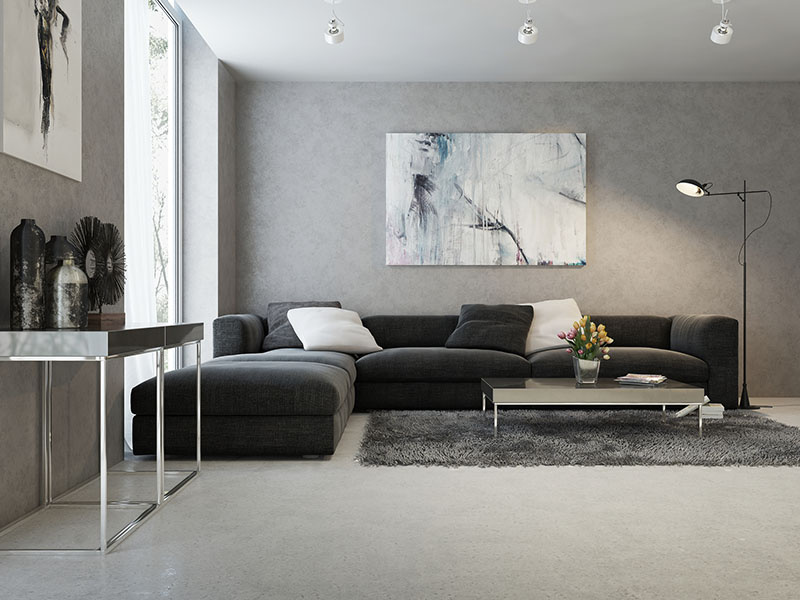
In the loft and variations on its theme, complex colors are organic, as they emphasize the naturalness of the space and allow diverse textures to unfold. Gray and its shades in this style show themselves well in the form of characteristic industrial materials: concrete, tiles, metal.
Neutral range capabilities
The limited use of neutral shades is nothing more than a myth. There are many opportunities to use them in the interior and not turn the space into a boring spot. A neutral palette will balance even an overly colorful interior and add restraint and aristocracy to it.
Painted or textured walls create a versatile, calm tone for indoor living. It is not at all necessary to fill such an interior with bright details: the rest will be taken over by light.
Placed accents, even if they are gray, are also possible. In this case, an unusual shape and texture allows you to select an element. A neutral palette works in a similar way in textiles and decor: curtains and pillows do not have to be conspicuous, sometimes they just need to be.
In the interior of a house, apartment
The muted scale does not need to be tied to a particular room or a particular style. Due to this, there are no restrictions on where and how much to use a neutral palette. This statement is true even for a nursery, where, at first glance, there should be more bright colors. On the contrary, toys, furniture, bedding, carpets and pillows will stand out better against a neutral background, and the variety of colors will not violate the integrity of the space.
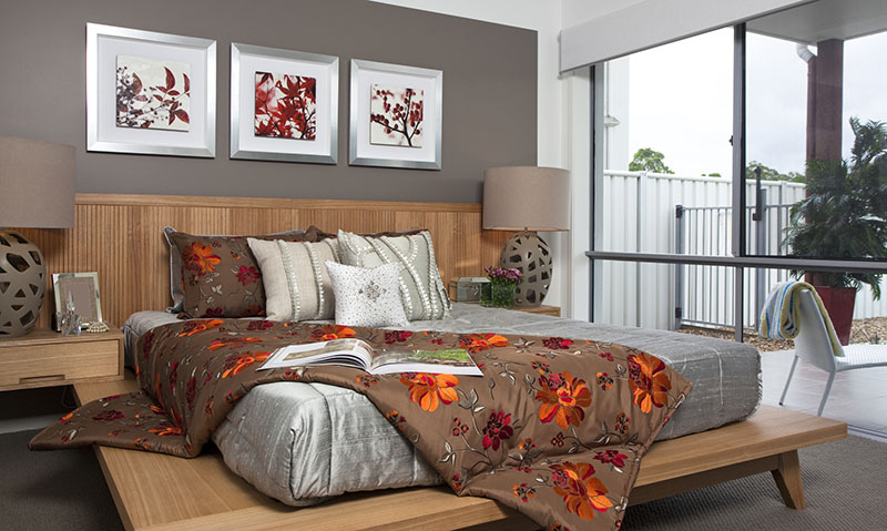
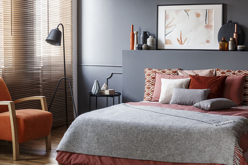
The soothing and relaxing effect of neutral shades is indispensable in the bedroom. In this case, gray and its variations perform the function of a boring beige. The range, no less safe in terms of style and compatibility, will not look trite, but it will not draw all the attention to itself.
In the bathroom, which traditionally contains the most glare, reflective, chrome and ceramic surfaces, neutral - and especially gray - shades create a truly luxurious environment.
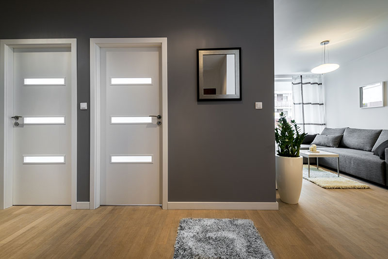
The hallway and corridor, designed in neutral colors, look laconic. Due to various techniques, you can even visually change the nature of the space: expand with the light surfaces of the walls, floor and ceiling and narrow with the dark ones.
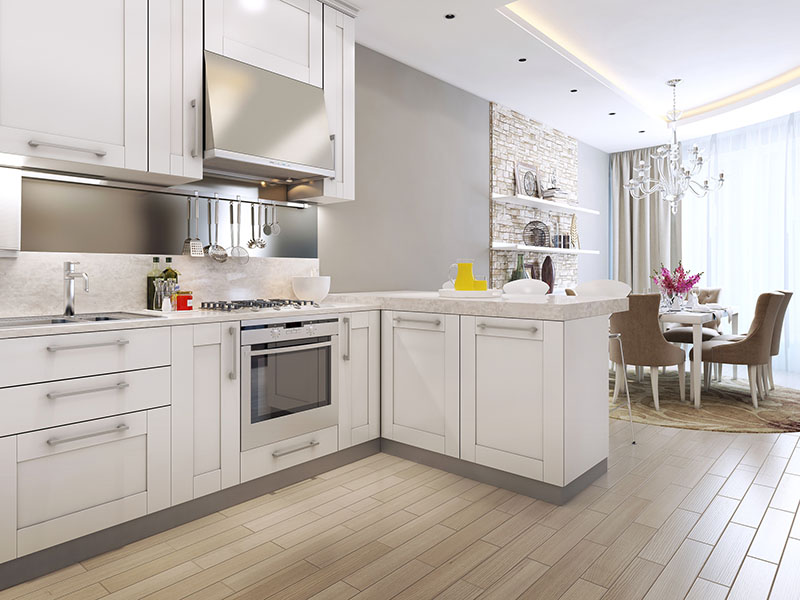
In the kitchen and dining room, there are also no restrictions on the use of a muted palette. The resulting room will be a good alternative to a white kitchen, since it will also allow you to combine multi-colored elements into an ensemble, and will not raise questions about the practicality of color.
Similar color options (not exact match):
| Dulux 00YY 63/024 | Dulux 19YY 61/057 | Tikkurila X486 | Tikkurila X487 |
Combinations of gray with other colors
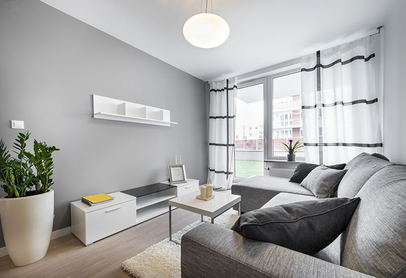
Gray allows for many color combinations. The duet of gray and white looks as easy as possible. So that the atmosphere does not seem too uncomfortable or cold, the colors can be diversified by adding other tones.
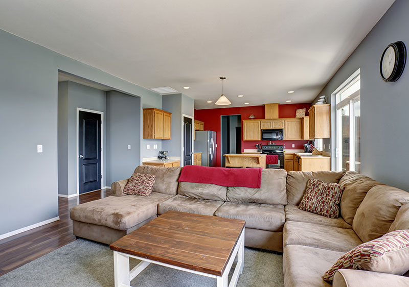
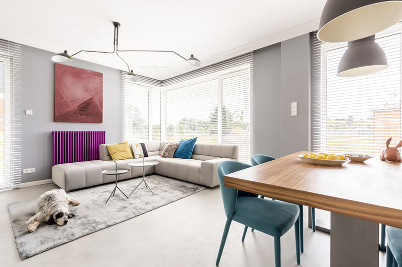
The combination of gray and red looks bright and life-affirming. Such an alliance is most typical for a loft, where concrete surfaces are adjacent to brick ones, but the same combination can be transferred to the usual modern style.
The gray-green range will be truly harmonious. You can achieve the desired effect even if you use not green objects, but living plants.
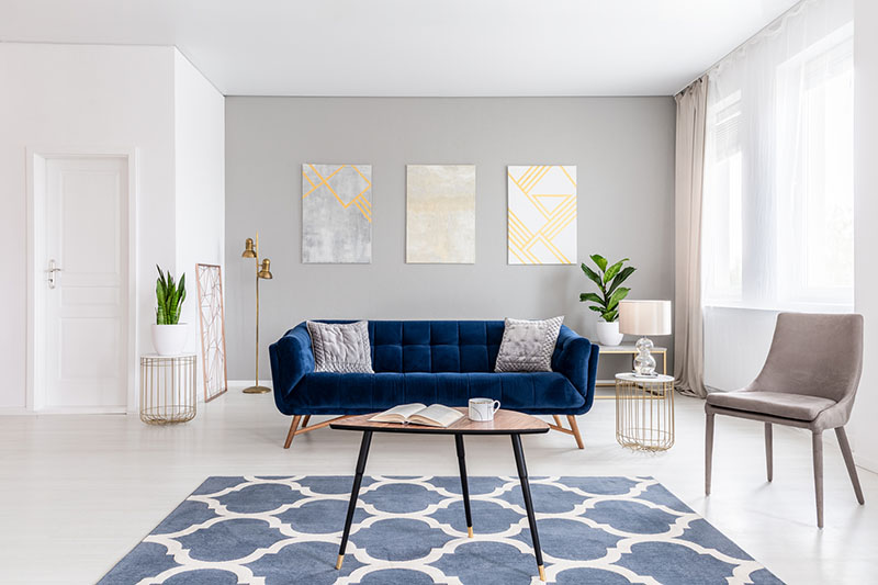
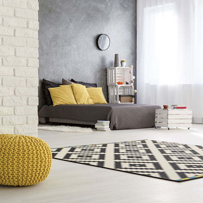
Combined with gold or yellow, gray creates a cheerful environment. The resulting space is both restrained and active, the main thing is to maintain balance and take into account the lighting.
In addition to color combinations, it is important to remember about other decorative elements for a gray interior. Refinement will help to add metal and glass details, mother-of-pearl or crystal, mirrors. Plants and textiles will add comfort. Natural fabrics show themselves especially well: silk, linen, wool, knitted things will look good. The expressiveness of skin, fur and leather on a gray background will make the interior attractive, and rough textures - brick, concrete - or natural wood will add texture and brutality.
Other colors in interior: