Pick the color for your room!
If you are going to paint the walls in your room, you can see how the color looks in the interior using the free online tool roomcolor.net
Our website contains the most popular palettes (color catalogs), which are used for machine tinting in stores.
- 1Choose a palette
- 2 Choose a room to paint
- 3Choose a color (rectangles)
- 4Click on a surface
- Use color families (circles) for more convenient moving to desirable color
- If you already know the color number, you can find it through the search bar.
- You can download your result as PDF or JPEG or share it via messengers.
Important information
- All colors of the presented palettes match with the colors on the official websites of manufacturers. But keep in mind that color perception on a screen may differ from reality. Therefore it is recommended to check the selected colors with fandeck in a store and make trial colors if necessary.
- Many factors affect the perception of the color of a topcoat. Among the main types, one can distinguish such as the degree of gloss of the paint (the more transparent the coating, the more saturated the color looks), the degree of surface illumination, the light source (sunlight or artificial lighting), the texture of the surface. Moreover, you may notice that you look slightly different. This is because different rooms have different lighting levels and different light sources.
- {{ item.value }}
- {{ item.value }}
Orange in interior design
Orange combines the characteristics of red and yellow. Energy and determination in him coexist with optimism and friendliness. Orange is appreciated by creative and emotional people who are open to communication. It is the warmest color in the spectrum and has no cold tones. The property of orange is known to stimulate appetite. And the color itself is associated with fruits and honey.
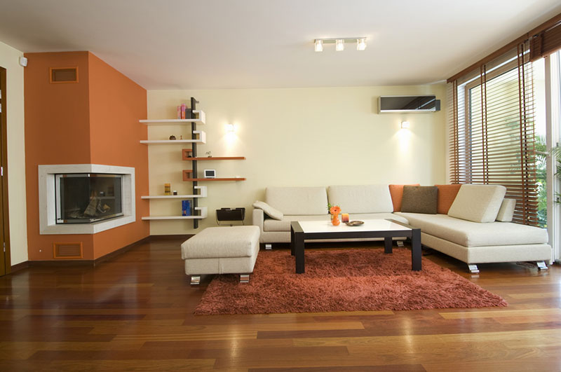
In the interior, orange is used mainly for accent. Accessories dilute soft beige colors and transform the setting. It is less common to paint walls and furniture in orange, since there is always a high risk of overdoing it with a rich color and getting an unlivable interior. Tangerine and amber colors are the choice of brave personalities. More compromise shades - ocher, terracotta, rusty and bronze - leave more room for finding the best combination.
This color literally enlarges objects and brings surfaces closer. When entering the room, the first thing a person will pay attention to is the orange objects, and it will seem to him that this object is closer. This property can be used to highlight some individual objects or visually adjust the space.
Where to use
Orange in a classic style is an unusual solution. Balance in this case can be achieved due to the contrast of brightness and saturation of surfaces and simple lines of furniture, layout, details of calm colors. More often in classic interiors, terracotta shades appear - the result of a mixture of orange and brown.
Orange looks appropriate in art deco, country, avant-garde and country. And in combination with other bright and warm colors, it allows you to create an ethnic style that conveys the spirit of the East or Mexico.
Due to the brightness and richness, the interior may require dim lighting. In too intense light, the properties of orange increase, and it is uncomfortable to be in an environment where there are too many colors. But natural and decorative light will allow the color to reveal its best characteristics.
Orange in an industrial style shows itself unusually. It softens the general coldness, but in this case its shade should be sustained and dark enough.
In the interior of a house, apartment
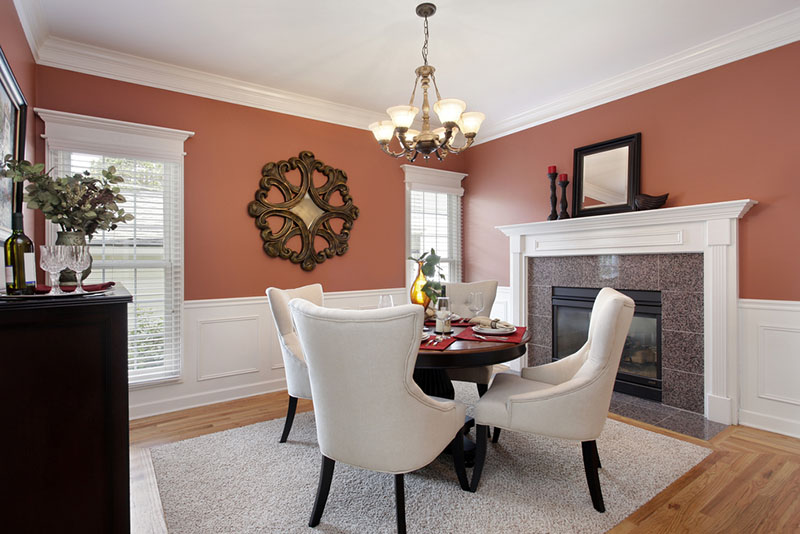
The appetite-stimulating property of orange makes it a great color for the kitchen and dining room. It can also be used to correct room imperfections. To expand the space, you can highlight one wall in a bright color, and paint others in a neutral shade. This will create the illusion of a higher ceiling.
To create intimacy, on the contrary, all walls should be covered with a saturated or dark shade.
It is better to choose an orange living room based on your taste and inner feelings. A compromise option for those who are not sure about the attitude to color is an accent detail, which, if desired, can be easily replaced with a similar one of a different color. These can be curtains, paintings, or decorative pillows. And if the goal is to recreate the mysterious atmosphere of the East, then you need to try to remove bulky furniture so that the room does not look cramped.
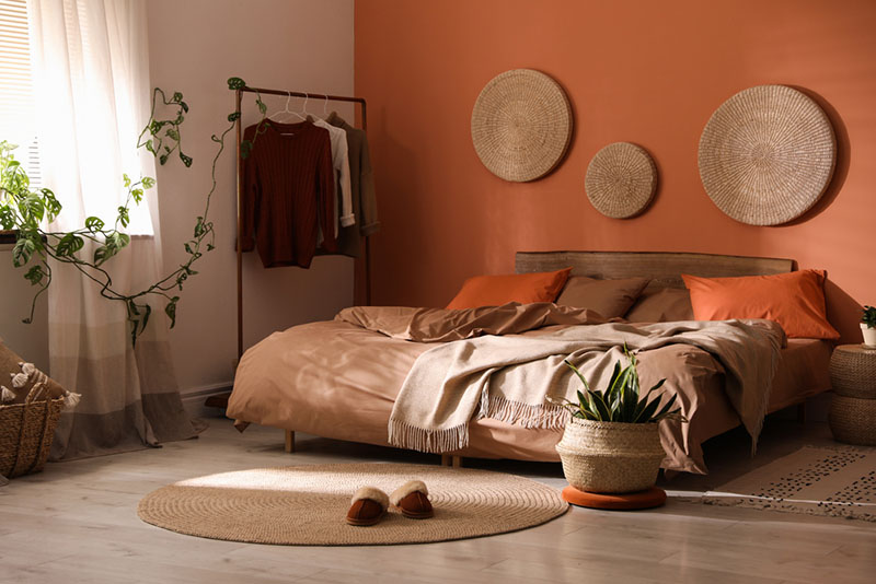
Orange is not recommended for use in the bedroom. It is better to give preference to pastel shades that will not "press" on the eye. It can be peach, apricot, or salmon in color. It's harder to fall asleep in a bright orange bedroom. On the other hand, the awakening in it can be faster. But in any case, the orange element should not be in front of the bed, and other colors should balance and even outweigh it.
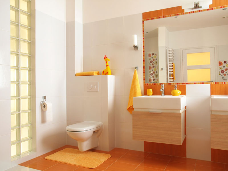
Orange is good for a bathroom because its energy comes in handy here. However, bright colors are not conducive to relaxation. Their task is to empower, not appease. Therefore, it is important to fit a strong color into the overall harmonious palette.
In the children's room, the presence of orange in the play or study area is justified: it stimulates brain activity and adjusts to activity. For not very lively children, such an interior can be useful. In addition, the orange palette is gender neutral and will be comfortable for both girls and boys in such an environment.
Combinations
Despite its intensity, orange forms quite a few harmonious and beautiful combinations. He works with neutral shades as well as other vibrant colors.
Although the combination of orange with pastel colors is not a good one, it can be a pleasant surprise if used skillfully. It works better with some shades. For example, with a light khaki in the spirit of the 70s, blue and pale yellow.
Orange is not ready to cooperate with all pastel colors. But experiments reveal its good compatibility with khaki, blue or pale yellow.
Orange will be appropriate in all apartments where there are light and dark shades of brown: sand, coffee, chocolate. The faded interior becomes more interesting and dynamic, even if the concentration of orange is very low. Moreover, in such an environment it will be comfortable and cozy.
Boiling white whiteness enhances orange hues. Against its background, they become especially hot. You can dilute the combination of white and orange with brown. This will help create coziness in the room, since natural material always has a calming effect.
Diluting the orange and white with black makes the furnishings very modern, stylish and graphic. Clean geometric lines will help to avoid the stifling atmosphere and oversharpness. A less radical option is to combine orange with gray.
In alliance with cool shades, orange becomes no less expressive. On a neutral beige background, you can combine orange and turquoise. You can enhance the impression and complicate the interior by using several adjacent cold shades with orange, for example, turquoise, green and pale blue.
The combination of orange with fuchsia and purple is gaining in popularity. Children, bathrooms, hallways and kitchens are often painted in these colors.
Other colors in interior:
Gray and neutral shades in interior