Pick the color for your room!
If you are going to paint the walls in your room, you can see how the color looks in the interior using the free online tool roomcolor.net
Our website contains the most popular palettes (color catalogs), which are used for machine tinting in stores.
- 1Choose a palette
- 2 Choose a room to paint
- 3Choose a color (rectangles)
- 4Click on a surface
- Use color families (circles) for more convenient moving to desirable color
- If you already know the color number, you can find it through the search bar.
- You can download your result as PDF or JPEG or share it via messengers.
Important information
- All colors of the presented palettes match with the colors on the official websites of manufacturers. But keep in mind that color perception on a screen may differ from reality. Therefore it is recommended to check the selected colors with fandeck in a store and make trial colors if necessary.
- Many factors affect the perception of the color of a topcoat. Among the main types, one can distinguish such as the degree of gloss of the paint (the more transparent the coating, the more saturated the color looks), the degree of surface illumination, the light source (sunlight or artificial lighting), the texture of the surface. Moreover, you may notice that you look slightly different. This is because different rooms have different lighting levels and different light sources.
- {{ item.value }}
- {{ item.value }}
Red in interior design
Red in the interior is the choice of the bold and energetic. Love, passion, strength are traditionally associated with this color. Not surprisingly, in terms of the excitement that red causes, it has no equal. Red inspires, tones and invigorates. You can turn these useful qualities of color to your advantage by using red as the main color of the interior. Psychologists confirm: red mobilizes, has a positive effect on working capacity and endurance, but at the same time it can irritate, tire and suppress. At the physiological level, such a powerful effect is manifested in the form of a rapid heartbeat, increased production of adrenaline, and sometimes increased temperature, so this color should be used wisely in the interior.
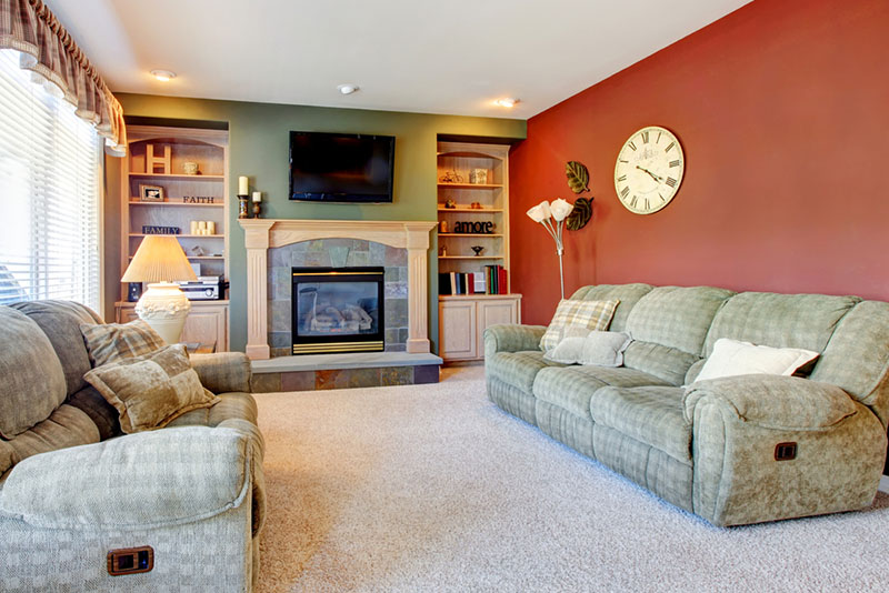
You can start experimenting with red with small - bright accents. They can be small accessories: pillows, clocks, paintings - which will bring a spice into the room. Red furniture or curtains are more pretentious, but they can fit into a neutral interior, thus making it energetic.
For a long time, red interior items have become a kind of classics of interior solutions, least of all associated with it, according to the logic of the layman. Red toilets and bathtubs, as well as red household appliances - perhaps the clearest evidence of a person's courage, the desire to go beyond.
Using red as the color of the walls, it is important to remember about its property of visually narrowing the space. However, this is not always a bad thing: it can be quite cozy in such a room. But then the lighting should be as thoughtful as possible so that the interior does not look ominous.
Ideally, red walls should allow breathing, that is, not overload the space. Such a wall can not be further complicated - it already takes all the attention by itself. However, if you place photographs, shelves with collections or souvenirs on it, the "exhibition" technique will favorably emphasize the features of the items placed.
Where to use
Despite the seeming pretentiousness, red looks great in a variety of interiors. Of course, he will find a place in the avant-garde, empire, art deco and minimalism, in interiors in the style of fusion, pop art or eclecticism. But even in a classic setting, red will be able to prove itself. Burgundy and cherry shades create a sophisticated and luxurious atmosphere.
In the interior of a house, apartment
In bedrooms, the concentration of red should be restrained, since the strong energy of the color does not contribute to relaxation. On the other hand, a bedroom decorated in red tones sets up an erotic mood, so this option may seem the most successful for individual married couples. At the same time, it is important to remember: repairs are done for a long time, and the chosen range can get tired over time. So the choice is better in favor of darker shades.
A less aggressive shade of red - pink - looks more appropriate in a bedroom. Pink tones just tune in a romantic mood, and are also able to neutralize aggressiveness and hostility. But for pink, there are questions of gender stereotypes: not all men accept the universality of colors by themselves, so it will be difficult for many married couples to agree on pink walls.
Red, along with blue and yellow, is firmly associated with the children's world: bright pure colors can perfectly convey an atmosphere of carefree and joy. So you can use red for design or decoration of a room. As in the rest of the premises, the measure is important: bust, as established by research, is fraught with negative consequences for the psyche and health. Ideal is to choose red accent pieces and dilute it with neutral and muted colors.
A study or living room, made in various shades of red, will be associated with wealth, power and aristocracy. Even without any sophisticated decor, such rooms look impressive and luxurious.
The bathroom is a special place in the home. In it, people not only carry out hygiene procedures, but also receive an emotional charge. Red tiles or mosaics in the bathroom are good because a solid bright color is crushed into small pieces and is perceived more easily. In such a frame, white plumbing begins to look really dazzling.
In combination with natural shades - brown and gray - red in the bathroom is associated with oriental traditions and, as a result, various spiritual practices to harmonize the spirit.
In the kitchen, as a rule, red becomes the main color of the fronts of the kitchen set. The choice of its shade has its own subtleties. Warm colors are good for kitchens with windows facing north and west: this way the furnishings will compensate for the lack of sunny color. Where the windows are oriented to the south and east, cold shades are more appropriate - muffling sun rays. If the facades are made in different colors, for example, white and red are combined, then the designers advise using a bright color for the lower drawers, since bright upper drawers located at eye level will tire faster.
Combinations and shades
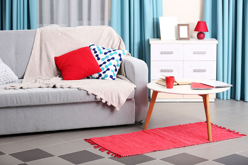
The most common combination of red and white always looks fresh and original. White cools the ardor of red and allows you to expand the boundaries of the room, and, if necessary, zone it.
Combining red with noble brown or light gray, you can get a discreet interior of an English living room. In such an environment, there is a feeling of solidity and accuracy. The more popular brick and terracotta shades found in nature are ideal for this purpose. You can also ensure a sufficient presence of dull red with the help of decorative brickwork.
A romantic interior will help to create diluted shades of red: scarlet, pink, cherry, crimson. They are inherently less active and allow you to relax.
In fact, there are many more alternatives to red than you might think. There are about a hundred shades of red, which are divided into main groups: scarlet, crimson, fiery, red-brown, dark red. Red absorbs shades of reddish brown, burgundy, cherry, rusty, scarlet, maroon, terracotta, chestnut, coral. Any of these shades can be the main tone. The darker the tone, the more masculinity it carries. The lighter, softer - the softer the atmosphere he is able to create.
Violet in interior design
Purple is a contradictory color due to its nature. It is a mixture of aggressive red and cool blue. Depending on their ratio, violet can be both warm and cold, serve as a background or be an accent detail. In nature, purple is found in the buds of some flowers, in fruits and at sunset under certain lighting. Therefore, it is not surprising that many associate this color with spring and romance, and also with magic and mystery. In addition, purple in the interior for many may turn out to be the "new black" - this is a suitable option when you want "something dark, but not black."
Combining two opposites, purple is well suited to creative and artistic natures who love experimentation. It brings relaxation and pacification, awakens a romantic mood, however, if used incorrectly, it can create a melancholic mood, in which it can become uncomfortable for a long time. Therefore, when developing a concept, it is important to represent not only the general color composition, but also specific shades so that the resulting atmosphere does not overwhelm a person.
Where to use
The classic interior style is dominated by soft, calm tones of purple. They will look with gold or silver ornaments, the preferred floor and ceiling finish in this case is light. Brighter and more saturated colors will find application in pop art, hi-tech, modern and minimalism styles.
Lilac shades reminiscent of blooming sakura will help to introduce Japanese motifs into the atmosphere. For a complete look, you will need warm wooden furniture, free space and themed decor.
Regardless of style, purple is good primarily for textiles. As upholstery of chairs, curtain fabric.
Walls painted purple can perform different functions depending on the saturation of the hue. Light dull tones visually expand the space - in this they are similar to light blue colors. Dark purple “gathers” space well.
As an accent spot, purple, like any other bright color, should be balanced with more soothing tones. And, like red, it looks good on functional technological items: household appliances, kitchen furniture, dishes.
Purple is also good because its most complex shades are suitable when there is a desire to create a calm, muted interior, but do not want to use a "universal beige".
In the interior of a house, apartment
Primarily purple colors are good for rest, meditation and relaxation areas. Purple in the bedroom often becomes a compromise for couples in which one of the partners does not accept pink. Gender-neutral in nature, purple at the same time carries out part of the function of red - it awakens sensuality and a romantic mood. Combined with white linens, the combination will be more classic, with active colors - bold, modern and energetic.
In the living room, purple can be used to decorate recreation areas or home theaters - if available. A good solution is to choose a lilac rug or pillows in shades of lavender and dark violets. A bolder option is to use color in the upholstery of massive armchairs.
Purple takes many forms in the nursery. They turn to him if they want to get away from the stereotypes "girls are pink", but still there is a desire to create a dreamy environment. For this, gentle lilacs are suitable. Purple is also appropriate in a boy's room: as one of the space theme elements, for example. The intensity of the color may depend on age - the older, the brighter, more provocative, but it is important not to overdo it.
In spacious apartments, purple kitchens look elegant, especially when it comes to a space combined with a living room. Purple headset is a stylish solution, but it is important to consider that the color looks lighter on glossy surfaces, and darker on matte ones. If you want to get a noble, deep color, you can increase the concentration of blue in the color, the resulting color will not look too pretentious, but at the same time quite unusual.
Light shades of purple, reminiscent of foam on the sea waves at sunset, in the bathroom create an atmosphere suitable for relaxation and long bathing procedures. They will expand the space and become a good backdrop for laconic furniture and sanitary ware.
Combinations
Natural violet is well set off by objects of white, gray and metallic colors. This whole range gives rise to an interesting combination of natural and technical principles.
A combination of rich purple with wood is almost a win-win: natural oak, yellowish or orange species, and even dark wood are suitable.
The contrasting option - to add light green to purple - is interesting in that it evokes a strong association with a blooming garden, however, the shades must be selected carefully, taking into account future lighting, since it is not easy to find a middle ground in this case.
A combination of purple and yellow would be less risky. As complementary colors, they provide an interesting space in which the cheerfulness of yellow or even orange balances the melancholy and mysteriousness of purple.
Paired with blue, violet, close to it in composition and tone, creates a calm interior. Complementing the space with close or contrasting shades, you can solve a variety of tasks: from creating a calm soft environment to organizing an inspiring and vibrant environment.
With another “founder” color - red - purple sounds no less interesting, especially if the tandem is muted with neutral and cold colors. For a less intense composition, brown is suitable.
Other colors in interior:
Gray and neutral shades in interior