Pick the color for your room!
If you are going to paint the walls in your room, you can see how the color looks in the interior using the free online tool roomcolor.net
Our website contains the most popular palettes (color catalogs), which are used for machine tinting in stores.
- 1Choose a palette
- 2 Choose a room to paint
- 3Choose a color (rectangles)
- 4Click on a surface
- Use color families (circles) for more convenient moving to desirable color
- If you already know the color number, you can find it through the search bar.
- You can download your result as PDF or JPEG or share it via messengers.
Important information
- All colors of the presented palettes match with the colors on the official websites of manufacturers. But keep in mind that color perception on a screen may differ from reality. Therefore it is recommended to check the selected colors with fandeck in a store and make trial colors if necessary.
- Many factors affect the perception of the color of a topcoat. Among the main types, one can distinguish such as the degree of gloss of the paint (the more transparent the coating, the more saturated the color looks), the degree of surface illumination, the light source (sunlight or artificial lighting), the texture of the surface. Moreover, you may notice that you look slightly different. This is because different rooms have different lighting levels and different light sources.
- {{ item.value }}
- {{ item.value }}
Yellow in interior design
In interior design, yellow is usually used cautiously, and for good reason. Many are confused by the fact that a bright color will quickly get bored and start annoying. Much more willing to do repairs with less flashy shades - beige, vanilla, cream, sand. However, in fact, yellow - the color of the sun and sunflowers - can charge you with vigor and good mood, which is especially important in not too sunny climates. In the right "doses", yellow will help to reveal mental abilities and awaken appetite, and it also copes with the task of expanding space and creates coziness. Of the entire spectrum, this is perhaps the lightest and most positive color.
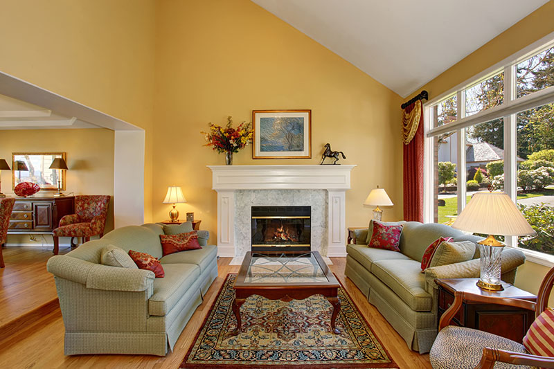
The easiest way to introduce yellow into the interior is to use it for some bright detail. A good solution would be to choose curtains in a bright shade - this way you can artificially let light into a room that faces the north side.
Yellow textiles are easy to change - so you can and should experiment with them. For those who are more daring, the option with colored sofas, chairs and tables is suitable. An even more radical option is to put yellow doors, which can be an interesting accent in a minimalistic light space. But yellow walls require not only courage, but also knowledge of the basic combinations, otherwise the interior can be made unsuitable for life.
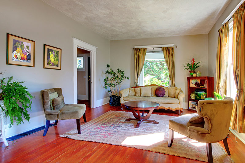
Where to use
Yellow walls can be used in different interiors. Calm shades look appropriate in combination with classic finishes, the balance in this case is achieved with the help of skirting boards, cornices and moldings and wood textures.
Bright and rich colors work great in modern styles. You can paint only one wall yellow, against which colored decor and unusual furniture will look great. This is appropriate both in a modest Scandinavian interior and in a shocking modern one.
In the interior of a house, apartment
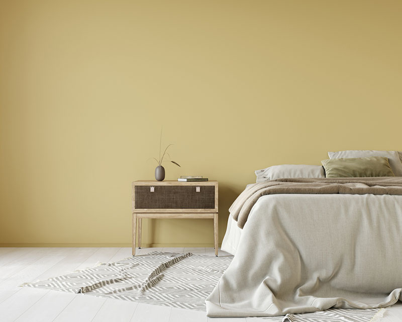
You can use yellow in any room, the main thing is to withstand the atmosphere that prevails in the room. In the bedroom, for example, pure yellowness can be very annoying, so it's better to take the shades. For a clean and fresh space, for example, cream with white is suitable, and for an enveloping effect - mustard combined with graphite.
In the nursery, yellow sometimes suggests itself: children love bright colors, and yellow among them takes pride of place. Sunny shades stimulate brain activity, which is especially important for the time of active development in the preschool period. However, these same properties can be especially active, so the temperament of the child must be taken into account. For example, a bold but beautiful combination of yellow and light green will help maintain balance.
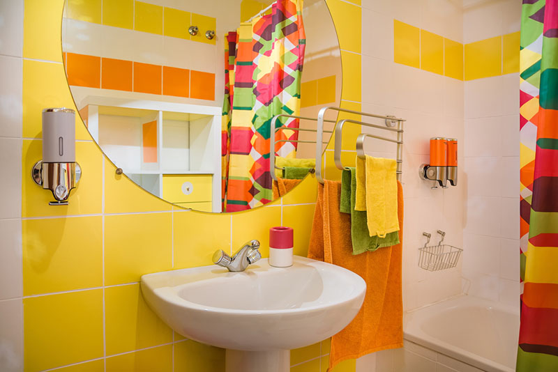
In the bathroom, yellow is able to bring maximum benefit. The invigorating effect is especially good for those who have difficulty waking up in the morning.
Similar properties work well in the kitchen and dining room. In this case, you can even use color for the facades of the kitchen set. In such an environment, as a rule, the appetite is better awakened, and the positive emotions obtained with the meal will allow you to keep a charge of vivacity until the evening.
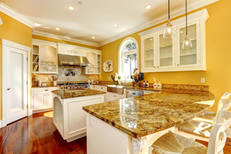
It is noteworthy that in public spaces, yellow is shackled into a more rigid framework. For example, when decorating a cafe, it is always important to take into account that energetic yellow is not particularly pleasant for adults, especially women; it will look much more appropriate in a youth space. It is also important that yellow can strongly distort the color of the skin, which can subconsciously reject potential visitors.
Combinations
Yellow is one of three colors that cannot be obtained by mixing. Therefore, it is not difficult to find a suitable combination with his participation. But in the interior, the task is complicated by the fact that the resulting gamut should not put pressure on a person, so both designers and psychologists recommend not to multiply the energy of yellow, but to muffle, dilute.
A win-win classic is the combination of yellow and white. This combination allows you to fill the space with air and light, expand it, fill it with freshness. A combination with light blue or gray will give the same effect.
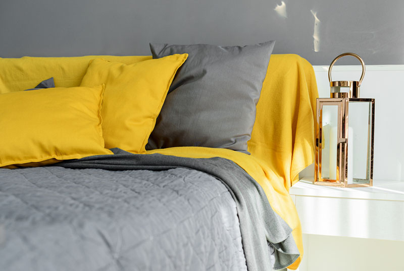
The triad of yellow, white and black looks interesting: such an interior is as balanced as possible, and the space begins to look expensive. But the combination of only yellow and black can be unsuccessful. Together in nature, they signal danger - this color is typical, for example, for bees, wasps and hornets - stinging insects. So in this case, the shades must be selected with great care. Another win-win solution is the interior in dark gray and mustard colors, in which wood looks especially expressive.
Another texture that works well with yellow is metal. Copper, bronze and gold, or silver and steel are beneficial counterbalances. This tandem can be supplemented with light apricot and peach tones.
A cheerful summer palette is created by the union of yellow and green. Natural shades are well suited for nurseries and kitchens, fit perfectly into eco-style, becoming a suitable backdrop for living plants.
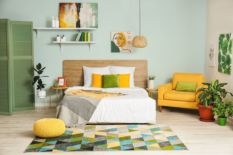
The combination of active yellow is possible with ... yellow, or rather, with woody shades: beige, light yellow, orange. In such an interior, black or gray will be appropriate graphic accents. You can deepen and darken the space by adding emerald, dark woody, blue and burgundy to the light translucent yellow.
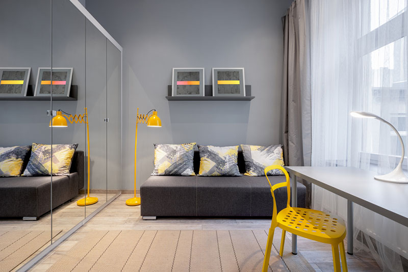
For bold decisions, contrast is good. On the color wheel, yellow is opposed by purple. The combination of yellow and deep blue is no less popular among lovers of bright shades. But in both cases, it is important to balance the rich colors with calm background shades and textures.
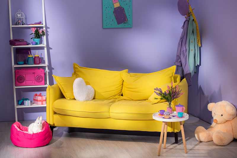
Finally, any interior with a not very successful combination of yellow with other colors can always be improved by adding items of other bright shades. Together, red, blue, yellow and green can save a room by creating a unique dynamic atmosphere.
Other colors in interior:
Gray and neutral shades in interior
